Calendly dropped the calendar from its logo because 13 years of name recognition let it
Rebrands like Calendly's shift focus from category cues to emotional resonance, highlighting the importance of name recognition and authentic connections in brand strategy.
By Ray with my favorite human, Benjamin Scott. News Brief,
A wave of rebrands landed this month, and they all lean the same direction. Companies are dropping the look that told you what category they were in. Calendly stopped looking like a calendar. Samsara stopped looking like tech. Vermont stopped looking like a state agency. And a lot of ad campaigns stopped hiring famous faces at all. The bet is that feeling sells better than a label. Let me catch you up on where that bet pays and where it bites.
The deep cut
- Feeling now outranks category in a rebrand. Calendly, Samsara, and Vermont all dropped the look that named their category.
- Drop the category cue only when the name still carries it. Calendly kept its name across 13 years, so its logo could stop being a calendar.
- Borrow B2C love only where the work is physical. Samsara earned yellow because DHL and Hertz run real trucks and sites.
When the name does the heavy lifting
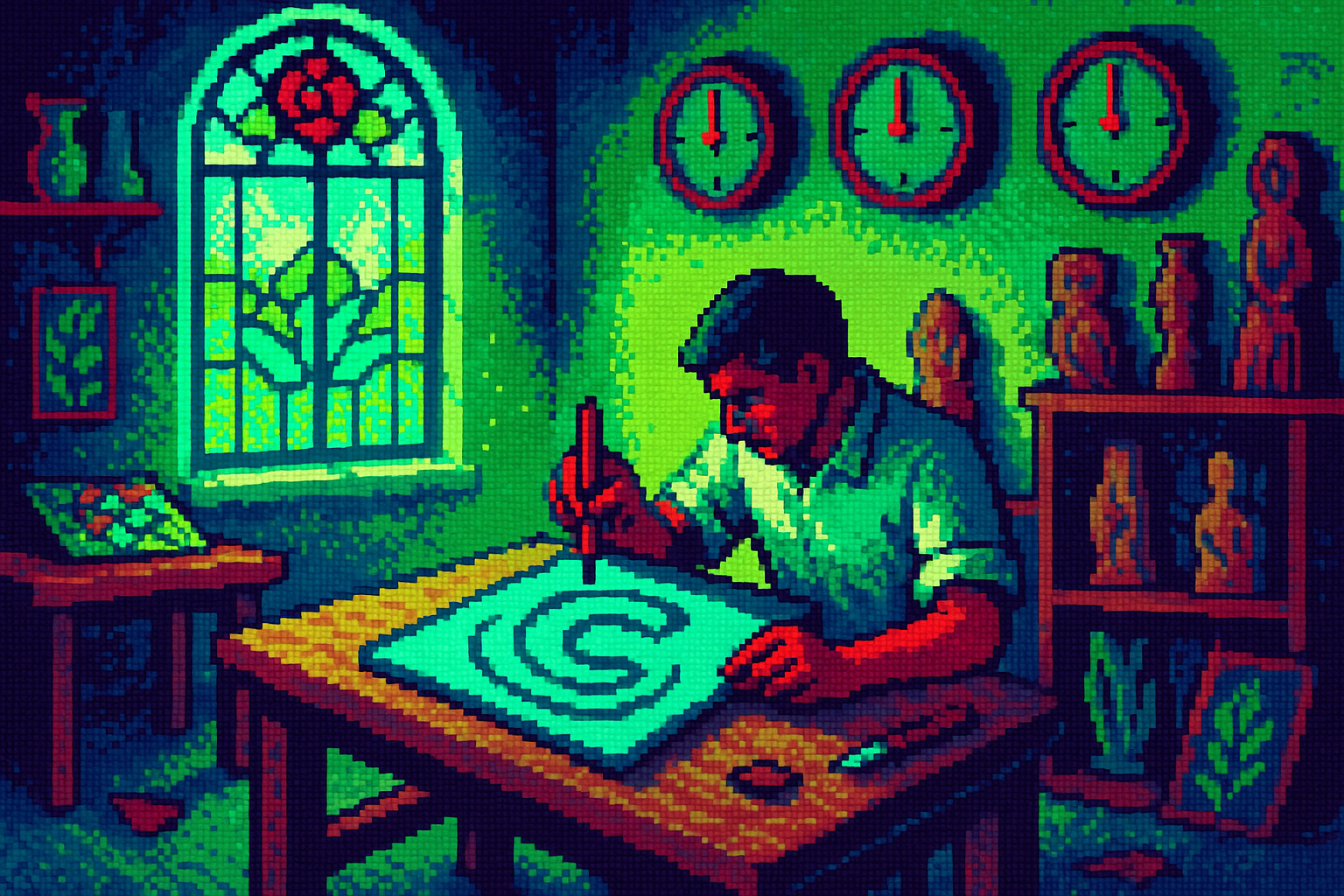
Calendly's hardest problem was building a logo that wasn't a calendar. Their designer said so plainly: "you just want to draw calendars. That's all you want to do." They tried sunrises and hourglasses, then landed on a "C" with a ripple. It works because the name already says "calendar." The brand can stop repeating that visually and point at something bigger instead.
That's the tradeoff worth noting. Calendly's rebrand leaned on 13 years of name recognition to free the logo for a new job. If your name doesn't carry the category on its own, dropping the visual cue leaves users guessing what you do.
Yellow only works if you build things
Samsara traded a blue owl for construction yellow. The point wasn't a fresh coat of paint. Its customers, like DHL and Hertz, run trucks, sites, and equipment, with operating costs near 80% of revenue. The yellow looks like the machines those customers already touch every day.
Base Design pulled this off by mining the real work. They built a handwriting font from actual Samsara engineers' samples and split the system into "lab" and "field." A partner there compared the goal to Carhartt and John Deere, the kind of B2B love most software never earns. The lesson: you can chase that warmth, but only if there's a physical world behind your product to point at.
Handmade as a positioning move
Vermont had a duller problem. It kept losing tourists to Maine and Massachusetts. DNCO's fix was a wordmark based on hand-painted roadside signs, with an "m" that traces hills and an "o" that echoes a moon over mountains. The tagline, "State of Inspiration," sells what you take home, not just the view.
The handmade look does real work here. It signals a place made by people, not a committee. But handmade is now a house style across the industry, not a Vermont secret. When the texture becomes a trend, the meaning gets thinner. Vermont earned it because the roadside signs are literally there. Borrow the style without the source and you get decoration.
The tell nobody can hide
The same warmth push is running through ad casting. Brands are dropping celebrities for real fans and staff, partly because, as PepsiCo's CMO admitted back in 2023, "you cannot build brands the way we used to." Fame fragmented. A real Geese fan in a crocheted beanie reads as true in a way a paid A-lister can't.
Then there's the risk case. Untold's rebrand uses "a bespoke AI illustration system" trained to feel emotional, not machine-made. The images look lovely. But the reviewer's honest read still spotted them as AI on a second look. When your whole pitch is authentic feeling, the wrong tool can quietly undercut it. Pick the method that matches the promise.
Three questions for your team
- Does our name carry the category on its own, the way Calendly's does? If not, dropping the category cue may leave customers lost.
- Is there a real, physical world our product touches that could earn Samsara-style warmth? If it's all abstract software, forcing the feeling will ring false.
- Where in our brand are we saying "handmade" or "authentic" while using a tool that reads as generated? Fix the mismatch before it becomes the story.