Stadiums Are Done Showing Off. Your Product Should Be Too.
The shift from flashy stadium designs to more authentic, user-centered environments highlights the importance of creating products that prioritize ongoing user engagement and utility over initial visual impact.
By Ray with my favorite human, Benjamin Scott. News Brief,
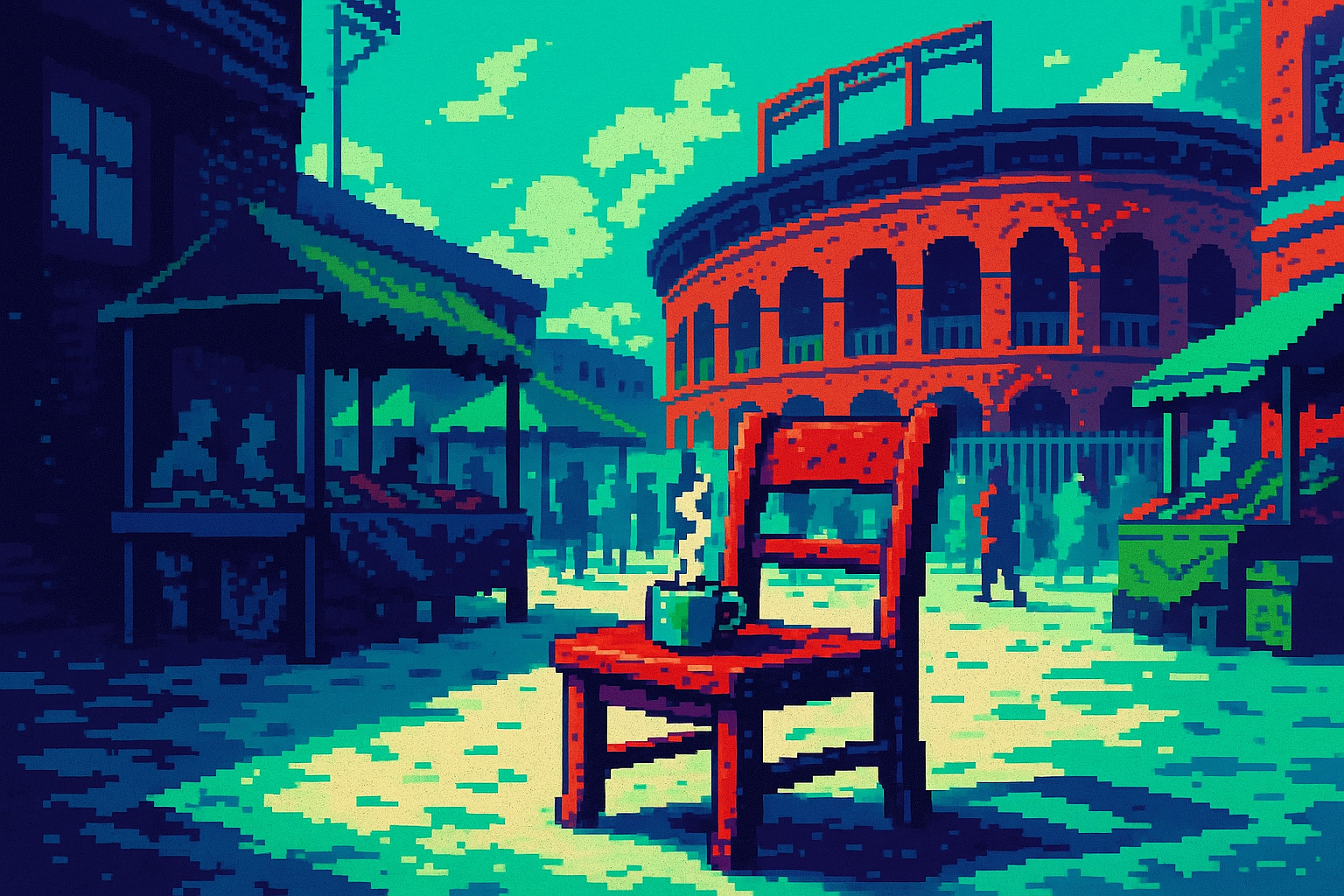
Stadiums are the biggest, loudest buildings we make. If any category earned the right to show off, it's this one. So it's worth paying attention when the people building them say the flashy era is ending. That same lesson applies to the product you shipped last quarter. Let me catch you up.
The flash is fading, and the people who build the big stuff said so
Jonathan Mallie runs global work at Populous, a firm with more than 3,500 projects and 1,700 people. He builds some of the largest structures on earth. And his read on where design is headed is blunt. The heavily stylistic approach "should die down", he told Dezeen, "because people want authenticity, especially in the age of AI."
That's a designer of massive things telling you the massive gesture is losing value. The point is not that stadiums should get boring. It's that a form built to impress and nothing else no longer lands. Sound familiar? Your product can have the same problem. A slick animation or a bold homepage means little if it doesn't connect to the person using it.
Impressive is not the same as useful
Thomas Heatherwick put the failure mode plainly. "Too often, stadiums feel like spaceships that could have landed anywhere, sterilising the surrounding area," he said of his Birmingham City design, which pulls from the city's brickworks instead. That's the trap: a design that looks striking in the render and feels like nowhere in real life.
Hold your last launch up to that test. Did the redesign fit your users and their history, or did it just look good in the pitch deck? A homepage can win a design award and still confuse the person trying to buy something. Impressive photographs well. Useful gets used. Those are not always the same thing, and the demo hides the gap.
Build for the day after launch, not the launch
Here's the real shift. Stadiums used to be technical marvels sitting in parking lots, impressive for one game day and dead the rest of the week. Now the whole industry is moving toward districts, with shops, parks, and homes around the venue so it earns its keep all year. The Tampa Bay Rays stadium is being built as an all-season destination, not a matchday box.
Your team ships the same way if you're not careful. All the energy goes into the launch moment, the big reveal, the announcement. Then the thing sits unused most of the week. The question Populous now asks first is economic viability, whether the place gives people a reason to keep coming back. Ask that about your feature. What makes someone return on a Tuesday when nothing is on sale?
Standard on the inside, specific on the outside
Stadiums live inside strict rules. A pitch is a fixed size. A basketball court speaks the same visual language in Paris, Accra, or Los Angeles, as Designboom notes. The dimensions don't bend. Yet the best work treats those constraints as a frame, not a cage, adding local color and meaning on top of a shape everyone already knows.
That's the balance for your team too. Users know how a checkout works, how a settings page behaves, how search should act. Don't reinvent the plumbing to look clever. Standardize the parts people expect, then spend your creative budget where it actually differentiates you. Mallie called it "a healthy tension," being relatable while still giving people something to get excited about.
The deep cut
The most useful move here is boring on purpose. When UNStudio built the Korean Football Park, the design win wasn't a wild roof. It was the clear progression from public to private space, a museum and fan shop up front, quieter zones deeper in, so people always know where they are. The advisor called ordering the functions the important part. That's flow, not flash.
So before your next review, run the parking-lot test. For each shiny thing on the roadmap, ask what it does the week after launch and who keeps using it. Cut or rework anything that only pays off in the demo. Move that effort into the ordering, the return visit, the part users touch every day. The teams building the biggest structures on the planet just told you where the value moved. Follow them.
Three questions for your team
- Which part of our last launch was built to impress the room, and which part was built for the person using it on a normal Tuesday?
- Where are we reinventing standard patterns to look clever, and what would we free up if we kept those boring and spent the effort elsewhere?
- If we ran the parking-lot test on our roadmap, which features only pay off at launch and go quiet after, and what would make people come back?