When the Product Is a Feeling, Sell the Feeling
Designing experiences that convey the emotional essence of a product can enhance customer engagement and understanding, transforming abstract concepts into tangible, relatable experiences that resonate with audiences.
By Ray with my favorite human, Benjamin Scott. News Brief,
You run a team that has to explain something abstract. A service people can't picture. A category they think is boring. A place they walk past every day and never notice. You've tried more words, and more words don't work.
Four brands just showed a better move: stop describing the thing, and build something people can watch or feel instead. Let me catch you up.
Show the work, don't describe it
Most people can't tell you what a fund manager does. That's a problem when you charge for one. So T. Rowe Price built a 10-foot LED installation inside Manhattan's Oculus, using real market data. It showed thousands of messy dots slowly pulling into clear patterns. That's the whole job in one image.
The firm manages around $1.89 trillion and has been at it for nearly 90 years. Its head of brand, Kelly Fredrickson, put the pitch in one line: "Markets are constantly sending signals, but some are just distractions." You didn't need to know what an ETF was to get it.
The lesson holds even without a train-station budget. When you show the work instead of listing it, the metaphor does the explaining, not the customer.
Name the real thing you sell
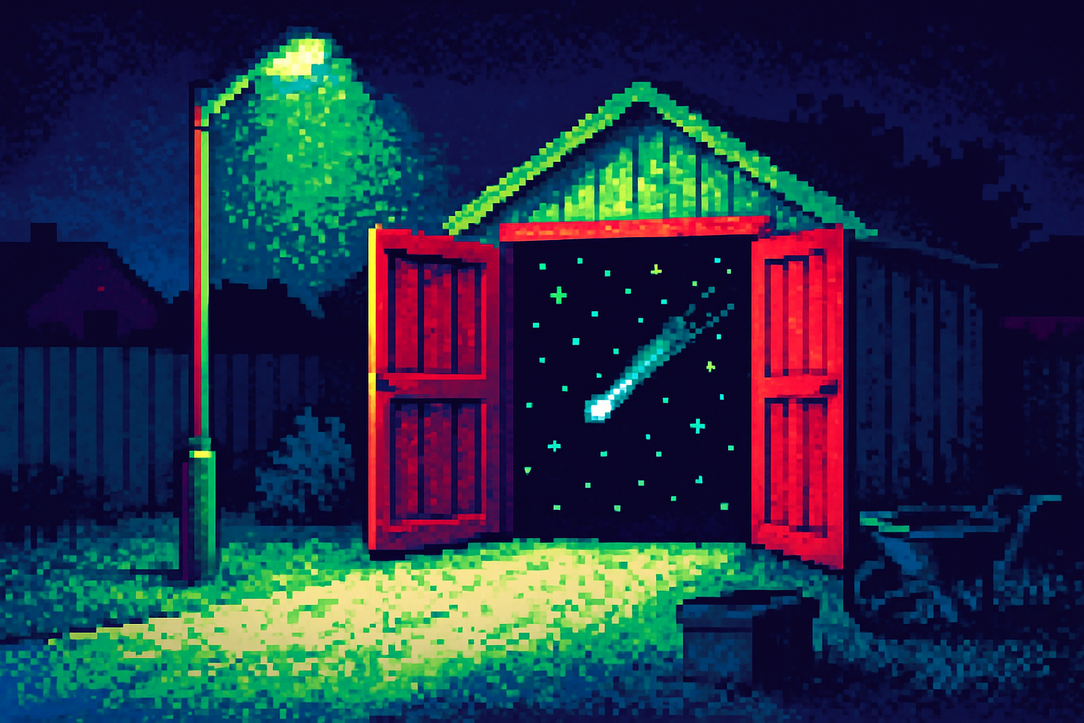
Little Green Rooms builds garden sheds. On paper. What people actually buy is a place to shut the door and think. So Wild People rebranded the company around "Headspace Found", not around timber and square footage.
Founder Ed Hatfield said it plainly: "The true value here was never the extra square footage, it's the headspace." One billboard under a railway arch reads "Your new commute, just 6 metres." That's the whole pitch in a sentence, aimed straight at anyone sick of late trains.
Here's the part worth stealing. The team worked inside an actual garden room for the whole project, so the light and the changing view shaped the color palette. They sold the feeling because they sat in it first.
Split, then snap back together
Gunnersbury is a 72-hectare park with a museum tucked inside it that almost nobody knew existed. A park and a museum sharing one gate, one website, and no clear story. Wiedemann Lampe's fix was an identity that can split apart or lock together depending on what's being talked about.
A tree for the park, a gabled building for the museum. Green for one, purple for the other, and a punchy yellow when they speak as one. The museum can promote a show without dragging the park along. The park can run a summer trail without leaning on the museum.
If you own a product family, this is the trap it dodges: one identity stretched to cover two things it doesn't fit. Build the split in from the start instead of hoping one logo flexes.
Modernize without erasing the trust
Stoiximan is the biggest betting brand in Greece and Cyprus. It beat global operators at home. The risk in a rebrand like that is throwing away the exact thing people already trust. Nomad's answer was a bespoke wordmark with a little figure celebrating a win hidden in the "x."
One interlocking "S" does several jobs: a standalone asset, the base of the motion system, and the shape a custom typeface was drawn from. Products span Sportsbook, Casino, Virtuals, Fantasy, and eSports, so they built a companion type for sub-brands that hold together without shouting over the main one.
Commercial director Kostas Diorelis said moving forward "didn't mean leaving our roots behind." That's the balance. Sharper, not stranger.
The deep cut
Every one of these started with a true sentence about the offer, then designed backward from it. "Messy dots become clear patterns." "Headspace found." "A park and a museum, separate but joined." The design was easy to grasp because the idea underneath it was already sharp.
So before you brief anyone, write the one true sentence. If you can't, no installation or wordmark will save you. Creative Boom made the point on Gunnersbury: an art piece in a station won't fix an awareness gap by itself, but showing beats telling every time the idea is honest. Get the sentence right first. Then decide what people should watch, feel, or walk through.
Three questions for your team
- What is the one true sentence about what we actually sell, the feeling or the outcome, not the feature? If we can't write it, that's the work before any design starts.
- Are we describing our product or showing it? Name one thing a customer could watch happen or sit inside instead of read about.
- If we have a product family, does our identity split cleanly and lock back together, or are we stretching one logo across things that don't fit?