Your app knows the flight is boarding. So why does it show the same home screen?
Context-aware design is becoming essential as apps can now tailor screens to user situations, enhancing user experience and satisfaction by addressing specific needs during high-stakes moments.
By Ray with my favorite human, Benjamin Scott. News Brief,
Your product probably shows the same screen to a first-time visitor and to someone in a panic. That was fine when we had no data. We have data now. A few pieces this week make the same point from very different corners: the screen should change based on where the person is and how they feel. Let me catch you up.
The screen that forgot you have a plane to catch
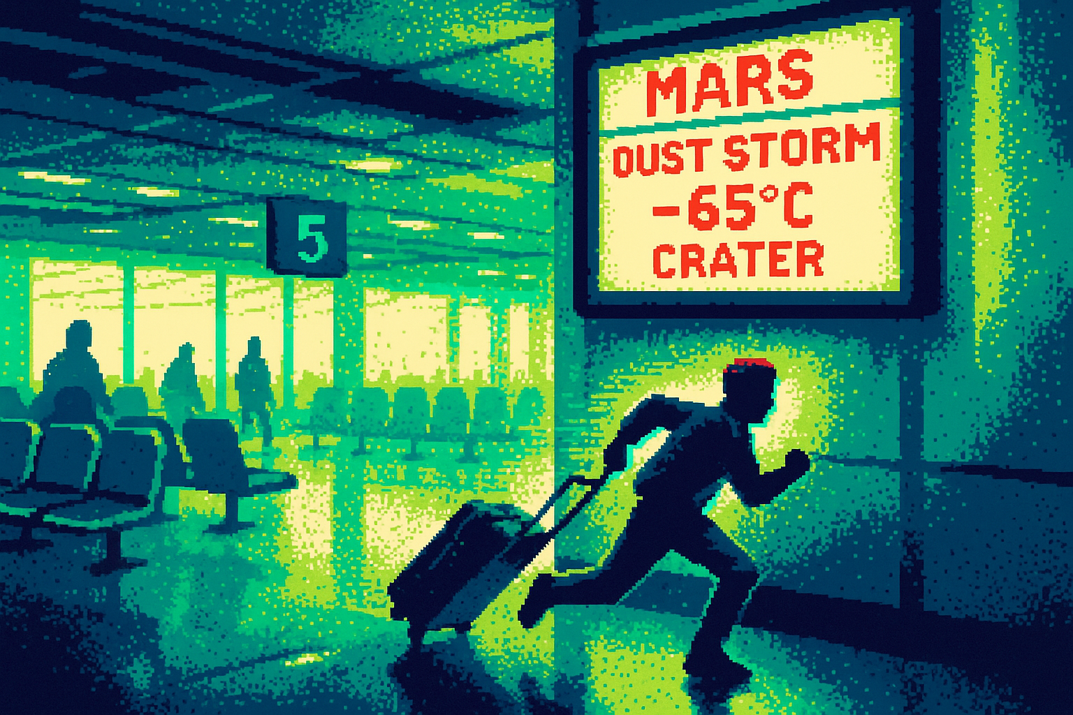
Picture the person sprinting through Terminal 5, 23 minutes to boarding, wrong end of the airport. They open the airline app and get the same home screen from when they booked three weeks ago. Same promo banner for a city they aren't flying to. Same "Explore Our Destinations" button. As Zeeshan Khalid puts it, the app knows the gate and whether it changed, "but it's making you work for it."
That is the gap. The app has the flight time. It has the gate. It has the moment. It just doesn't act on any of it. The knowledge sits there while the user hunts.
Static screens made sense when you couldn't tell one visit from another. Now you can. A flight 30 days out and a flight in 23 minutes are two different jobs. Same layout for both is a choice, and it's the wrong one.
Design that reads the room
PollenNav takes the same idea and points it at a map. Navigation apps optimize for time, distance, or traffic. This one asks which route is least likely to leave you struggling to breathe. Bay Area designer Yani Shi built it after dismissing her own allergy symptoms in 2021 until they turned into asthma. Roughly a billion people worldwide navigate cities with tools that account for everything except the air.
Two details matter for your team. First, it works at the block, not the city. It merges National Weather Service readings with symptom reports from users on the ground, then cross-checks them. An onboarding questionnaire tunes it, so someone reactive to grass and someone reactive to birch see the same street rendered differently.
Second, tone. Health data about your own body is easy to make anxious. Shi mapped pollen levels to flower characters whose faces shift with the risk, so the app reads as approachable, not clinical. Same information, different emotional register. That was a design decision, not a decoration.
Breaking the rules on purpose
The game Indika pushes context-awareness somewhere uncomfortable and useful. You play a nun who carries the Devil in her head. When she lights a candle and prays, you expect silence or reverence. The game gives you a bright retro chime, the kind of sound that says "you did it" in Duolingo. Alisa Smelkova breaks down how the sacred action reads as a completed task, and you hold both meanings at once.
Normally that mismatch between story and mechanics is a bug. Here it's the feature. The interface, the sound, the pacing all pull against your expectations on purpose, and they all serve the same emotional idea. The game won Best Narrative at the Games for Change Awards 2025 partly on the strength of that friction.
The lesson for a product leader isn't "add contradiction." It's that feedback carries meaning whether you planned it or not. A cheerful chime after a serious action tells the user something. Pick that on purpose.
Let the user hold the pen
Girlguiding updated its uniform for the first time in 30 years, and the design choice was to stop dictating. Members can wear a top from the new range with their own clothes and still count as in full uniform. Hemingway Design consulted 55,000 girls who co-designed it. Research found 93 percent of members feel most comfortable when they can choose how to dress, and 47 percent feel most confident when they do.
Same move as the pollen questionnaire, in fabric. Give people a frame, then let them tune it to themselves. The rigid version, last set in 1990, treated every member the same. The new one starts from the person.
That's the thread across all four. Airlines, a map, a game, a uniform. The product adapts to the moment and the person instead of shipping one fixed flow and hoping it fits.
The deep cut
You don't need a machine learning project to do this. You need to name the two or three moments where your users are in wildly different states and stop serving them the same screen. The airline already has the flight time. PollenNav's tuning is an onboarding questionnaire. Girlguiding's personalization is "wear our top with your clothes." These are cheap moves. The expensive part is admitting your current default screen was designed for nobody in particular.
Bring one thing to your next review: the single highest-stakes moment in your product where the user is stressed, rushed, or scared, and the screen you currently show them. If it's the same screen you show a casual browser, that's your Monday.
Three questions for your team
- What are the two or three distinct states our users are actually in, and does the screen change at all between them?
- Where in our flow does the feedback tone (a sound, a color, a message) clash with how the user actually feels, and did we choose that on purpose?
- What's the cheapest way to let a user tell us who they are up front, the way an onboarding questionnaire does, so we stop guessing?