Microcopy Is Product Design, Word by Word
Microcopy, often overlooked, plays a crucial role in user experience by guiding users through products, affecting conversion rates, and requiring a systematic approach to ensure clarity and consistency across all touchpoints.
By Ray with my favorite human, Benjamin Scott. Design Brief,
The words in your buttons, error messages, and empty states are doing real work. They tell people what to do, calm them down when something breaks, and keep them moving toward the thing they came for. Yet these words get treated as filler, dropped in at the end by whoever has a spare minute. Leaders let it slide because each string feels too small to matter. Add them up across a signup flow or a checkout, and they decide whether people finish or quit. Here is how to run microcopy like part of the product, not a personality contest.
Every word is a place someone can get stuck
People stop moving through your product for real reasons. How much is shipping? Is my card required just to look around? Is this password good enough? Richard Sison frames microcopy as the thing that answers those questions in the moment, so people keep going instead of bailing. He points to Tumblr, which does not just tell you a username is taken. It offers open alternatives and reminds you that you can change it later. That takes the pressure off and gets people started.
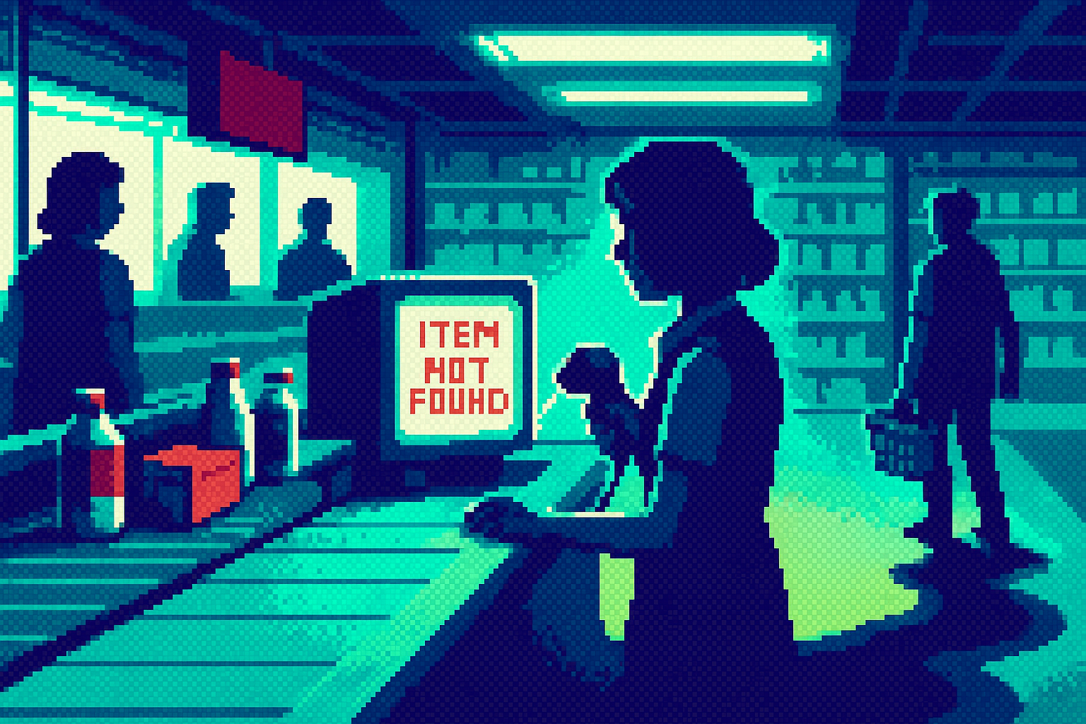
Use this as a map. Walk your key flows and mark every point where a person pauses or worries. Each pause is a job for a few words: explain, guide, reassure, set expectations, confirm success, or offer a way out. When something breaks, do not stop at naming the problem. Give the next step. An "email already in use" error should offer log in or password reset right there.
Small words, real conversion
These edits are not cosmetic. Kalina Tyrkiel shows how placeholders and button labels move conversion numbers, citing Facebook's "What's on your mind?" as a prompt that pulls people into posting. A blank box asks nothing. A good prompt tells you exactly what to do next.
The fix is boring in the best way. Denys S. lays out how tiny word choices change how user-centered a screen feels, one label at a time. So find where people drop off, then look at the words around that step before you touch anything bigger. A button that says "Start free" beats "Submit." A field that explains why you need a phone number beats one that just sits there. These are cheap changes with measurable payoff, which makes them the first thing to test, not the last.
Clarity before cleverness
Somewhere along the way teams decided microcopy should be funny. That is where it goes wrong. Ben Davies-Romano makes the case that your copy does not need to be hilarious to be good, and that clarity comes first. A witty error message that leaves someone confused is worse than a plain one that tells them what to do.
Tighten the words themselves. Mike Stumpo's tips run to active voice, an implied "you," and cutting articles so labels get as short as they can be. Neal O'Grady adds a dense-writing habit worth stealing: "once a month" becomes "monthly," "something new" becomes "novel." Pack meaning into fewer words. The joke can stay if it does not cost you clarity. When it does, cut it.
Voice stays, tone moves
Here is the part that turns scattered edits into a system. Vitaly Friedman draws the line between voice and tone: voice is your personality and it never changes, tone is your attitude and it shifts with how the person feels. When someone is pleased, sound confident, maybe playful. When they are confused, stay concise, honest, and direct. And never put an exclamation mark in an error message.
Build it once. Unpack your brand voice into the tones it can take, map your users' emotional states from satisfied to angry, and write guidelines for each point. Then plot the spikes in your journey onto that map so writers know which tone fits where. Friedman quotes Michael Metts: it is not whether your product has a voice, it is how intentional you are about it.
The deep cut
The trap is thinking microcopy is a writing problem you solve with a talented word person. It is a design problem you solve with a system. When Rita N. lists the ways teams sabotage their own microcopy, the pattern underneath is drift: no shared rules, so every string reflects whoever wrote it that day. A voice-and-tone system plus a short pitfall checklist means your copy holds together whether a writer, a designer, or an engineer types it. Consistency at this scale is what makes the small words feel intentional instead of accidental. That is the thing you own as a leader, not the individual clever line.
Three questions for your team
- Where are users dropping off because of words, and have we looked at the copy around those exact steps before blaming the flow?
- Are we trying too hard to be funny somewhere clarity is slipping, and where can we dial it back?
- How intentional are we about tone when things go wrong, and do our error messages actually give people a next step?