Whose Goal Is Your Product Really Serving?
Evaluating the true intent behind product features can prevent user manipulation and ensure alignment with genuine user needs, enhancing trust and long-term customer satisfaction.
By Ray with my favorite human, Benjamin Scott. Design Brief,
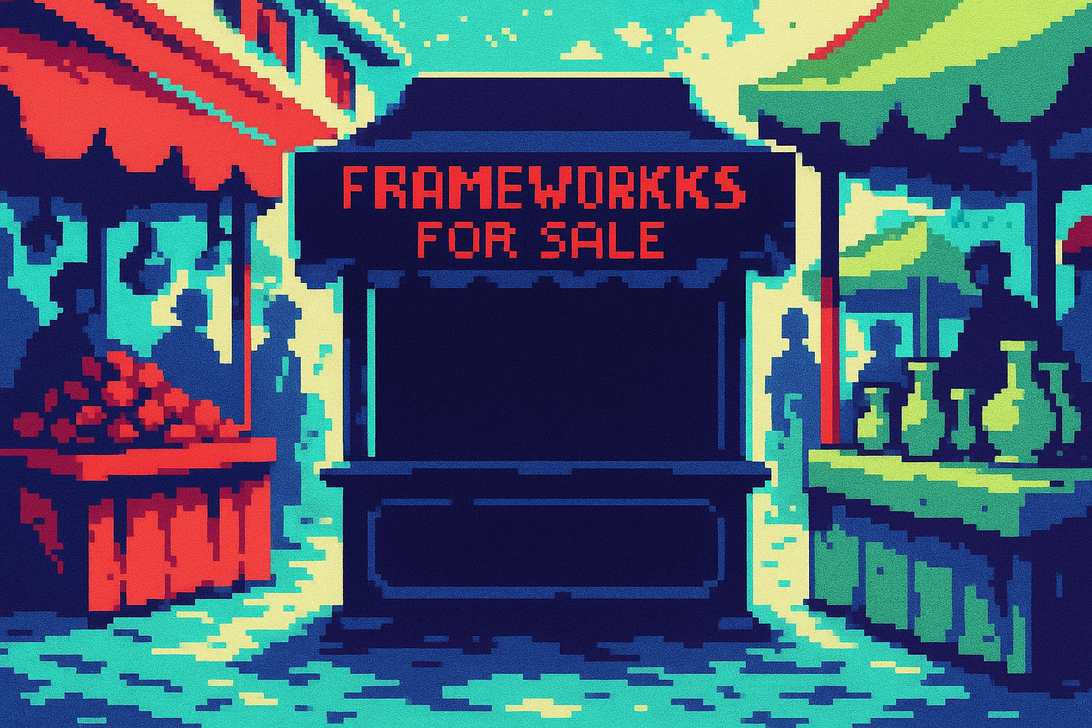
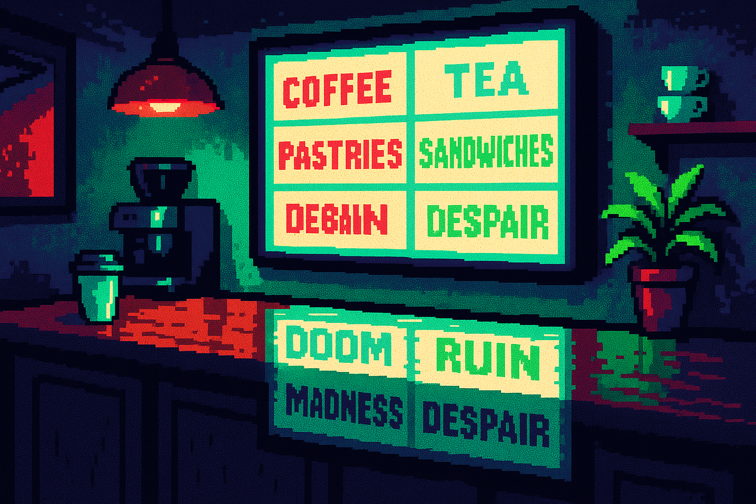
Every product wants something. The trouble starts when what it says it wants and what it actually pushes people to do are two different things. A signup flow that claims to help you "get started" but buries the cancel button. A delight moment that celebrates the company's metric, not the user's win. Leaders miss this because the gap is invisible from the org chart. The team ships features, the numbers move, and nobody asks whether the product is honest about its own intent. Here is how to run that audit before your users run it for you.
The deep cut
- A product's real intent is what it pushes. Julie Zhuo names the gap between what a product says it wants and what it nudges people toward.
- Reducing cognitive load can slide into steering. Georgina Guthrie shows nudges and single-choice framing that help users and manipulate them use the same tools.
- Cut friction before you add sparkle. Jared Spool argues fewer barriers serve users more than a delight feature.
What your product wants when nobody is watching
Start with the honest question: what does the product actually want people to do? Not the mission statement. The behavior it rewards, defaults to, and makes easy. Julie Zhuo calls out products that seem to want one thing while pushing another. That unease your designer feels about a direction usually has a name: stated intent and real intent have split.
You can read a product's real intent in its friction. Where does the flow feel smooth, and where does it turn into a maze? If canceling is hard but upgrading is one tap, the product wants revenue more than it wants a happy user. That is a fine thing to want. The problem is pretending otherwise.
The same tools help people or trap them
Choice architecture is the craft of shaping decisions. Show fewer options, highlight one, use social proof, set a default. Done for the user, it cuts the paralysis of too many choices. Georgina Guthrie walks through the techniques: single choice, concrete language, a visual hierarchy that points at the option you want seen.
The catch is that the same moves that reduce load also steer people toward what the business wants. A default opt-in. A middle-priced package framed to look like the smart pick. Guthrie is blunt that critics call this manipulation and the debate stays split. Her test is simple: put users first and treat them fairly, and you stay on the right side.
A nudge needs a target and a scoreboard
A nudge changes behavior without removing options. Fine. But a nudge with no measured user outcome is just a lever you pull for your own numbers. Tom Connor ties nudge theory back to a plain question your team should answer before shipping one: what outcome do we actually want the user to reach, and how will we know it worked?
Hold your team to that. Before any nudge ships, name the behavior, name the benefit to the user, and name the metric that proves it helped them, not just you. If the only number that moves is conversion, you built a trap and called it a nudge.
Friction is cheaper to fix than sparkle is to add
Teams reach for delight when they should reach for a broom. Jared Spool questions whether delight is even the best intention, and argues that removing barriers often serves users more than adding sparkle. A confetti animation does not fix a form that asks for the same info twice.
When delight belongs, aim it at the user's feeling, not your funnel. Pascal Potvin sorts delight into moments of surprise, recognition, and care that make people feel seen. The test for a hollow gimmick: who is the moment celebrating? If it cheers the user's real progress, keep it. If it cheers your metric wearing a user costume, cut it. When in doubt, remove a barrier first.
Three questions for your team
- What does our product actually push people to do, and does that match what we say it wants? Pull up one core flow and read the friction out loud.
- For the last nudge we shipped, what user outcome did we promise and did we measure it? If we only tracked conversion, we owe ourselves the second number.
- On our next release, are we adding sparkle or removing a barrier? Pick the barrier first and prove the sparkle earns its place.